In my previous post, I went over the basic concepts in machine learning and I used a very small amount of data. I got great feedbacks but also notes to make more complex example with bigger dataset. In this post I will use a bigger dataset and use pandas , seaborn and scikit-learn to illustrate the process.
Linear regression
Linear regression is a very simple supervised machine learning algorithm – we have data (X , Y) with linear relationship. we want to predict unknown Y vales for given X. X can be one or more parameters.
Before we start we need to import some libraries:
import matplotlib.pyplot as py
import seaborn as sb
import pandas as pd
In this example we will use a dataset from seaborn library (seaborn provides statistics graphs as an extension to matplotlib)
df=sb.load_dataset('tips')
There are other datasets builtin seaborn library – see documentation
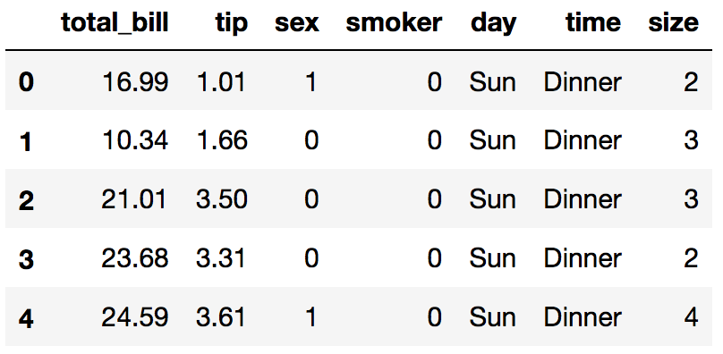
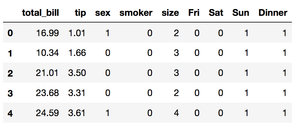
Lets look at the data:
df.head()
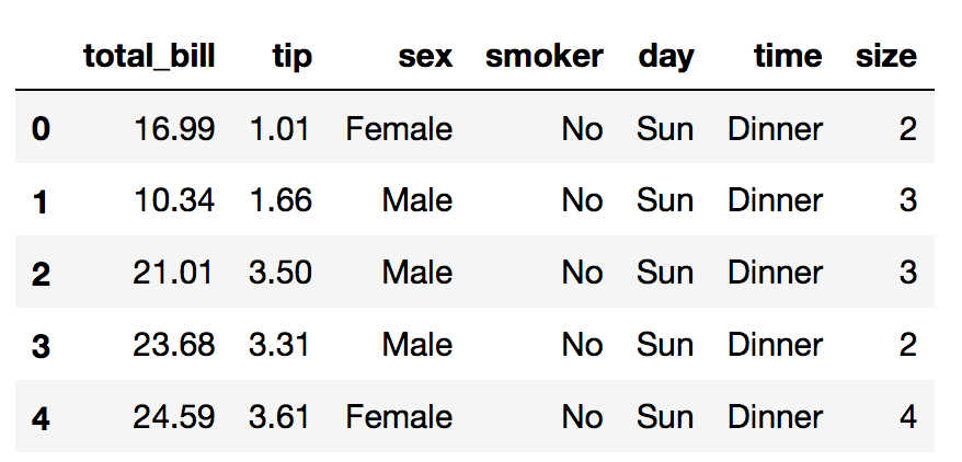
The dataset contains tips data from different customers females and males smokers and non smokers from days Thursday to Sunday, dinner or lunch and from different tables size
We want to predict how much tip the waiter will earn based on other parameters
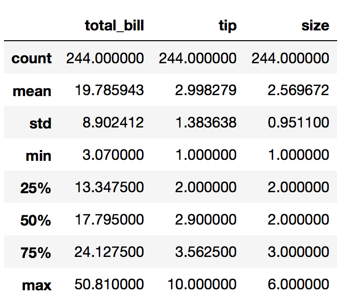
First lets look into the data using some dataframe methods :
df.info()
<class 'pandas.core.frame.DataFrame'>
RangeIndex: 244 entries, 0 to 243
Data columns (total 7 columns):
total_bill    244 non-null float64
tip           244 non-null float64
sex           244 non-null category
smoker        244 non-null category
day           244 non-null category
time          244 non-null category
size          244 non-null int64
dtypes: category(4), float64(2), int64(1)
memory usage: 7.2 KB
df.describe()
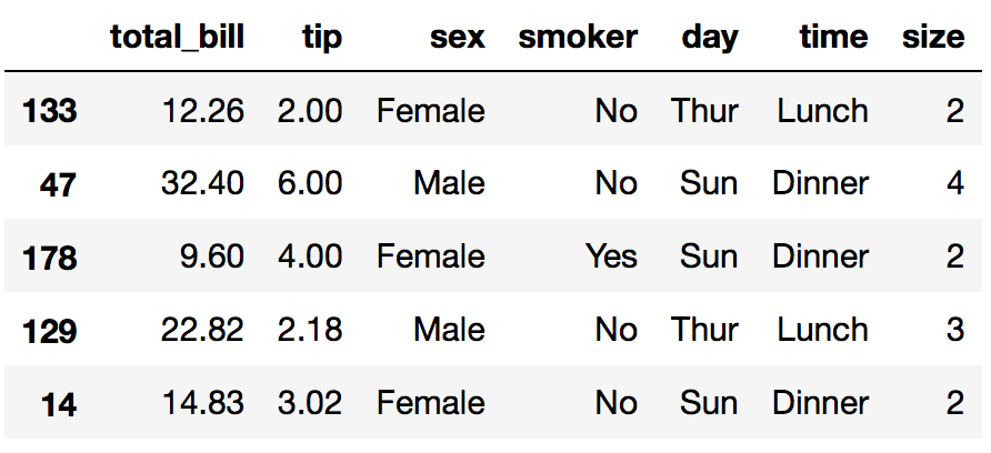
df.sample(5)
Data analysis with Pandas
Now lets answer some questions:
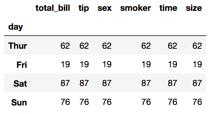
What is the hardest day to work ? (based on number of tables been served)
df.groupby('day').count()
Lets find out what is the best day to work – maximum tips (sum and percents)
df2=df.groupby('day').sum() # sum per day
df2.drop('size',inplace=True,axis=1) # sum of size column is not relevant
df2['percent'] = df2['tip']/df2['total_bill']*100 # add percents
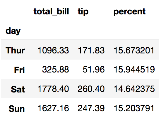
we can see that the tips are around 15% of the bill
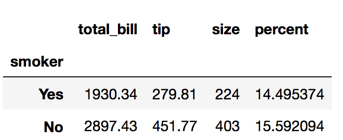
who eats more (and tips more)? smokers or non smokers?
df3=df.groupby('smoker').sum()
df3['percent'] = df3['tip']/df3['total_bill']*100
Lets group by day and table size:
df4= df.groupby(['day','size']).sum()
df4['percent'] = df4['tip']/df4['total_bill']*100
df4.dropna() # drop null rows
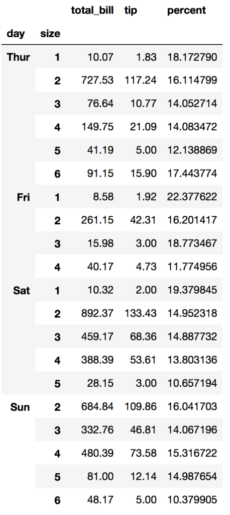
(smaller tables are better to serve)
Visualization with Seaborn
lets draw some seaborn graphs:
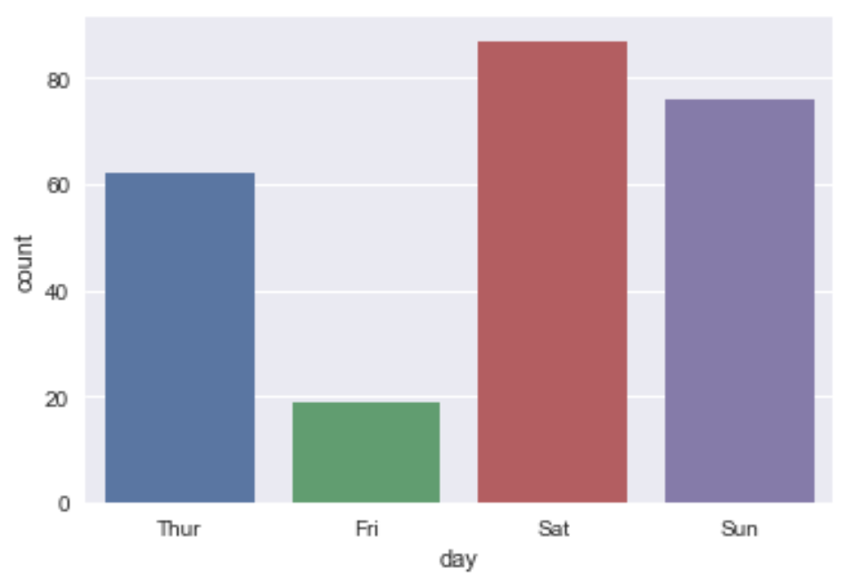
Tables per day
sb.countplot(x='day' ,data=df)
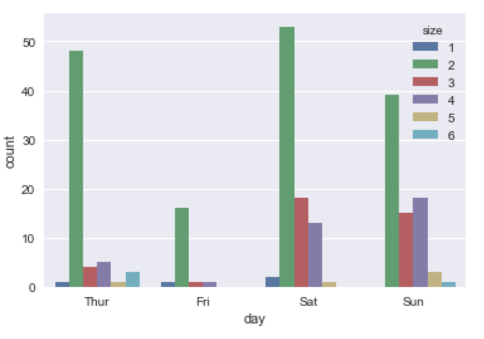
Tables per day per size:
sb.countplot(x='day',hue='size' ,data=df)
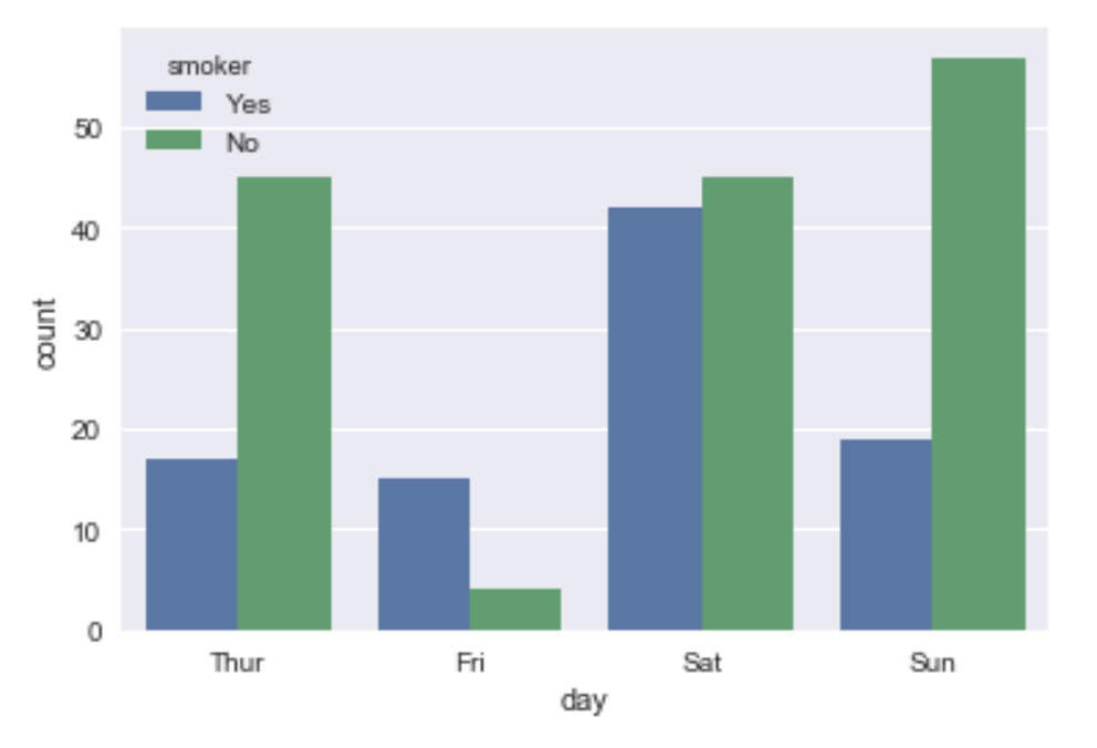
Smokers or not ?
sb.countplot(x='day',hue='smoker' ,data=df)
Transform and clean the data
Before we start building our model, we need to convert all the text values into numbers. We can do it in many ways:
- Using update statements
- Using replace method
- Iterate over the rows
- Use dummy variables
Using replace:
convert sex and smoker columns to values
df.replace({ 'sex': {'Male':0 , 'Female':1} , 'smoker' : {'No': 0 , 'Yes': 1}} ,inplace=True)
df.head()
Using dummy variables:
The values in day column are: Thu, Fri, Sat, Sun we can convert it to 1,2,3,4 but to get a good model, it is better to use boolean variables. We can achieve it by converting the column into 4 columns – one for each day with 0 or 1 as values. In pandas library it can be done using get_dummies:
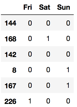
days=pd.get_dummies(df['day'])
days.sample(5)
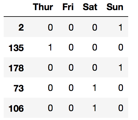
Actually we can drop one of the columns without loosing data – for example if we drop column ‘Thur’ we know that index 135 is Thur because all other days are 0. It is also supported by the same function:
days=pd.get_dummies(df['day'],drop_first=True)
days.sample(6)
Do the same with time column and concat all data frames, Also we don’t need the day and size columns anymore so we drop them
days=pd.get_dummies(df['day'],drop_first=True)
df = pd.concat([df,days],axis=1)
times=pd.get_dummies(df['time'],drop_first=True)
df = pd.concat([df,times],axis=1)
df.drop(['day','time'],inplace=True,axis=1)
df.head()
Building our Machine Learning model
Now we are ready to build the linear regression model:
We create a list of features as X and predicted as Y
X = df[['sex','smoker','size','Fri','Sat','Sun','Dinner']]
Y = df[['tip']]
Now lets split the data into test and train so we can test our model before we use it – we decide to split 70% – 30%:
from sklearn.model_selection import train_test_split
from sklearn.linear_model import LinearRegression
X_train, X_test , y_train , y_test = train_test_split(X,Y,test_size=0.25,random_state=26)
Now lets train the model with X_train and y_train:
model = LinearRegression()
model.fit(X_train, y_train)
And predict the X_test values:
predictions=model.predict(X_test)
We can now look at the predictions and compare it with y_test
We can draw a graph to see the difference distribution:
sb.distplot(y_test-predictions)
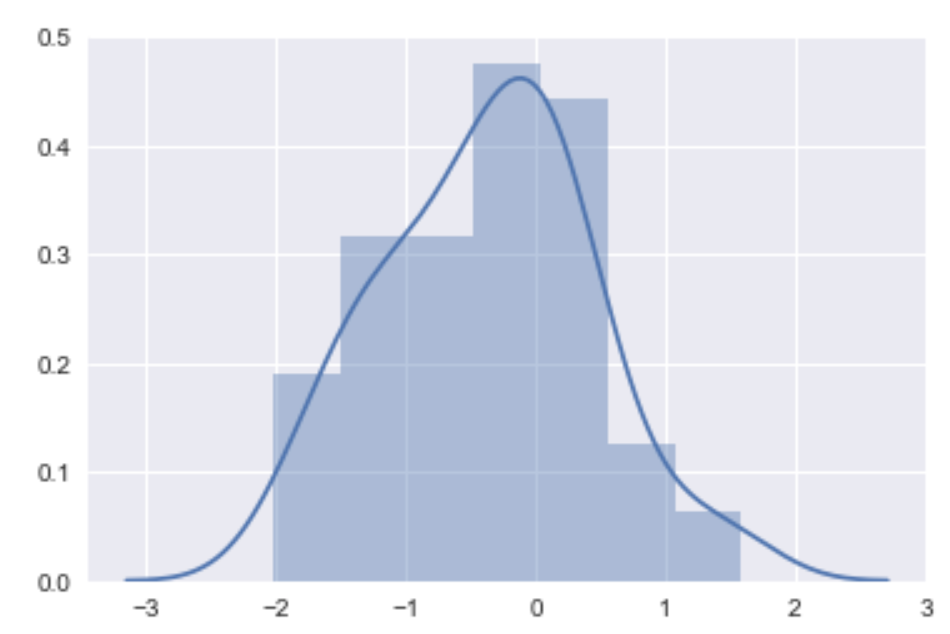
We can see from the graph that most of the times the predictions were correct (difference = 0). We can continue working on the model , adding data and play with the parameters
If we want to predict new value for example :
We have a 3 size table smoker male on friday lunch:
>>> myvals = np.array([0,1,3,1,0,0,0]).reshape(1,-1)
>>> model.predict(myvals)
array([[ 3.12444493]])
we expect to get 3.12$ tip
And the same table on dinner:
>>> myvals = np.array([0,1,3,1,0,0,0]).reshape(1,-1)
>>> model.predict(myvals)
array([[ 3.73414562]])
We expect to get 3.73$
2 thoughts on “Python Machine Learning Example – Linear Regression”
Comments are closed.
[…] For example with a bigger dataset and pandas see this post […]
Hi,
Can you help me in making me understand your conclusion about the distribution plot.
i am new to python and its concepts and trying to learn more about the language.
i am sorry to have asked such a silly question.
thank you